Alert
Informs users about new or important information

Usage
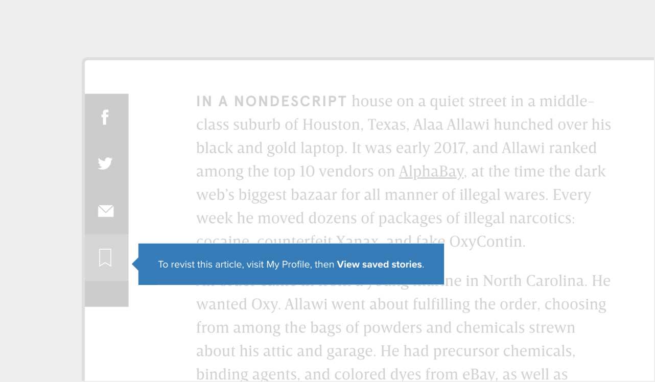
Alerts interrupt the user journey to convey necessary information. This component can be used either as a traditional tooltip that appears when the user hovers over something or as a notification that can be dismissed. Two common examples of alerts are to announce new features or show confirmation of a user action.
Since they disrupt the user's flow, alerts should be used only when truly needed. They can be placed over, under, to the right, or to the left of their targets. Icons can be included either before or after the alert text.

